The “Creative Playground” Trap
Your website shouldn’t strictly be an extension of your personality, where visitors are met with an ever-changing space and don’t know what to expect. Your website should follow certain rules. That doesn’t mean you can’t show off your personality in your color or font choice, but you must ensure that these choices are accessible (colors) and legible (fonts).
If your website is too creative, visitors won’t know where to go and will become frustrated and leave. Does this mean you have to create something so boring and bland that you hate everything about it? Of course not! But like writing a novel, you need to understand the rules before you can break them.
Open-Ended vs. Contained Design
Contained doesn’t mean limited; it means effective. The Spruce Essentials: A clear homepage narrative, a substantial book page (not just a single button to Amazon), and a path to get readers to connect with you.
In a sandbox environment, small errors in decision-making accumulate over time, leading to a scattered and amateurish site. Trust me, I’ve made this mistake on my own site. It can be difficult to see the forest for the trees when you are working on your own site. I once spent three hours choosing between green/blue and blue/green while my services page was outdated. Note to self: the sandbox is a trap.
I recommend (even if you’re a pantser) that you start with an outline of how you want visitors to interact with your site. This can be a flow chart that will help you figure out your structure. You can also do a basic wireframe by drawing what you want your site to look like on a piece of paper before you start.
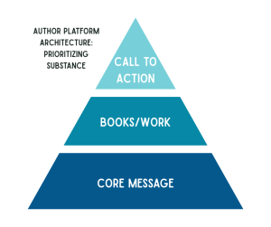
Contained design focuses on Information Architecture: organization, structured navigation, clear hierarchy, and clear language.
The Cost of Perfectionism
Authors can spend months editing and revising things that don’t matter while their actual platform sits unfinished (again, ask me how I know).
A sandbox is never done. A professional website has a clear goal: to get readers to take action (buying a book, signing up for a newsletter).
Tell your visitor what you offer, and how they can take action within the area above the fold (what a visitor sees when first landing on your site). If someone has to scroll down to figure out who you are and why they are there, you’ve already lost them. Apply the Three-Second Test: if a stranger lands on your homepage, can they tell who you are, what you’ve written, and what to do next in three seconds? If the answer is no, your website is burying your authority.
A sandbox website doesn’t just confuse your readers–it exhausts you! Every time you log in to make ‘just one more change,’ you’re using up the creative energy that should be going into your next chapter.
The Architecture Solution
You aren’t playing around in the sand or building this website for yourself. You’re building Authority Infrastructure.
This requires intentional decisions about positioning, tone, and hierarchy–not “just one more tweak”.
So, how do you do this? It’s all about how the site flows. You want to lead your visitor to take action in the most user-friendly way possible. Think of your website like your book’s structure. You wouldn’t hide the inciting incident in the wrong spot for the aesthetic. You place it where it serves your reader the best. Your website deserves that same intentionality.
If you’ve been creating a sandbox instead of a website and you’re ready for a solid foundation instead, this is exactly why I build websites for authors. I handle the architecture so you can get back to the sand that actually matters: your writing.